CSS cross-fade() function
Summary
The CSS cross-fade() function can be used to blend two images at a defined transparency.
Introduction
The ability to overlay one image with another and see them both in semi-transparency is a fairly common technique in web pages. This effect is generally accomplished by carefully positioning two images in the same space, one on top of the other, and then tweaking their opacity. The effect can be further enhanced by using JavaScript to manipulate the positions and/or the opacity.
That approach is of course not optimal, and requires considerable finesse in the CSS coding as well as some scripting ability. A straightforward CSS-only solution to image combination would be both easier to understand and simpler to code.
Part of the “CSS Image Values and Replaced Content Module Level 4” specification introduces this feature into CSS.
Use
The cross-fade() function takes three parameters: the two images to be combined and the percentage of combination. The percentage may be thought of as a transparency value for the “bottom” image, although technically neither image is really on top of the other, they are merely rendered together.
The cross-fade() function can be used in CSS anywhere that an ordinary image reference can be used. The syntax is straightforward:
cross-fade(<percentage>? <image> [, <image> | <color> ]?)
The percent value must be coded without quotes, must contain the “%” symbol, and its value must be between 0% and 100%.
Examples
For the following examples, we will use two images, each sized at 200px by 200px. The first, white.png, is a white-filled box with a 5-pixel blue border. The second, black.png, is a black-filled box with a 5-pixel red border. Thus, cross-fading the two images at different percentages should yield boxes of varying grays with borders of varying magentas. Here are the original images:


A 50% cross-fade
First, let’s set up an empty <div> to contain the images.
<div style="width:200px; height:200px;"></div>
We could, of course, give the <div> a background image.
<div style="width:200px; height:200px; background-image:url('white.png');"></div>
But that’s kind of boring, so let’s replace the simple background image with a cross-faded image pair.
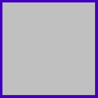
<div style="width:200px; height:200px; background-image:cross-fade(50% url(white.png), url(black.png));"></div>
The 50% cross-fade renders as an evenly-merged black/white (gray) box with an evenly-merged blue/red (magenta) border.

Other cross-fade percentages
Here are the code samples and their results for the same two images, cross-faded first at 25% and then at 75%. (Obviously, a 0% fade effectively yields only the first image, while a 100% fade yields only the second.) Note that the visual results are exactly what you would intuitively expect based on the original colors.
<div style="width:200px; height:200px; background-image:cross-fade(25% url(white.png), url(black.png));"></div>
<div style="width:200px; height:200px; background-image:cross-fade(75% url(white.png), url(black.png));"></div>

Simplifying the code
Clearly, that’s a lot of code to put on individual HTML elements, especially if the effect is repeated in the page. It’s far more elegant—and efficient—to abstract the cross-fade function into a single CSS style and then apply it to whatever elements require it. Here, we use an independent selector to define a class with the appropriate size and the appropriate cross-faded background image, and then simply use the class later in the document.
<style>
.cfade { background-image:cross-fade(50% url(white.png), url(black.png)); width:200px; height:200px; }
</style>

. . .

<div class="cfade"></div>
It should be noted that, once defined, our .cfade class is not restricted to <div>s; we can apply it to any page element and achieve the same effect.
<p class="cfade"></p>
Nor is the cross-fade effect limited to empty elements. Consider the following code and its result.
<p class="cfade">Four score and seven years ago our fathers brought forth upon this continent a new nation...</p>
A 50% cross-fade with text 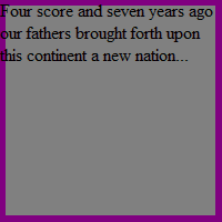
I didn’t say it was pretty, just that it was possible!
A final example
Here, then, is a more practical (and attractive) example. Let’s start with a beautiful full moon.
Full moon 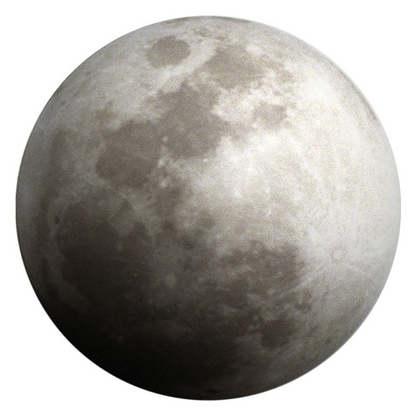
Then let’s choose a bold wolf silhouette for an overlay.
Wolf silhouette 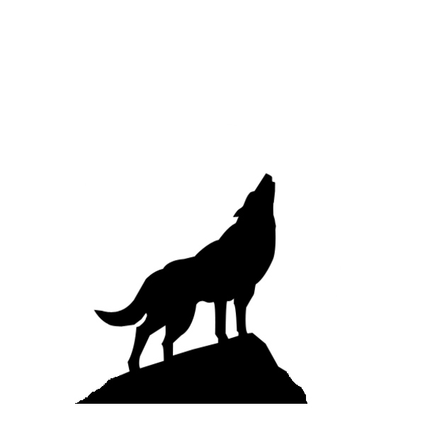
Now we’ll write the code to cross-fade them (directly on the <div> for simplicity). Note that while the images are the same size, they are of different types, one jpg and one png.
<div style="background-image:cross-fade(50% url('fullmoon.jpg'), url('wolf.png')); width:600px; height:600px;"></div>
The result is a classic (if somewhat kitschy) wolf-on-moon combo.
Wolf on moon 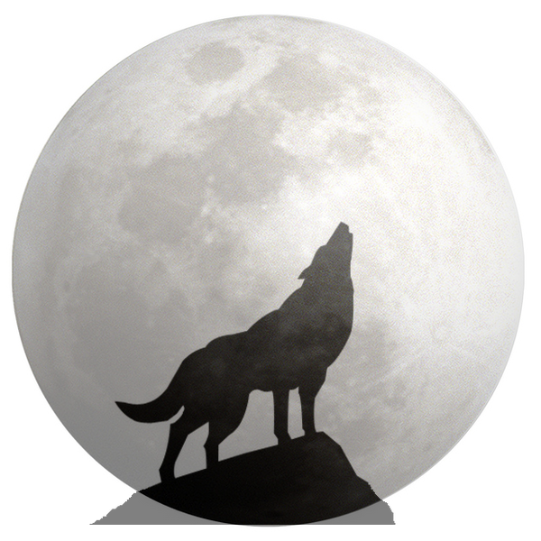
Related specifications
- CSS Image Values and Replaced Content Module Level 4
- W3C Working Draft